skip to main |
skip to sidebar

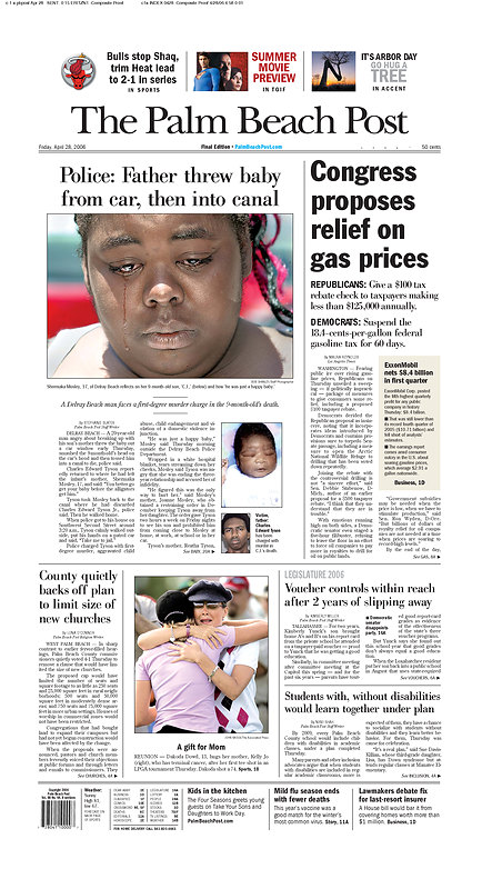
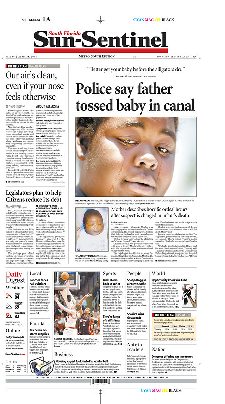
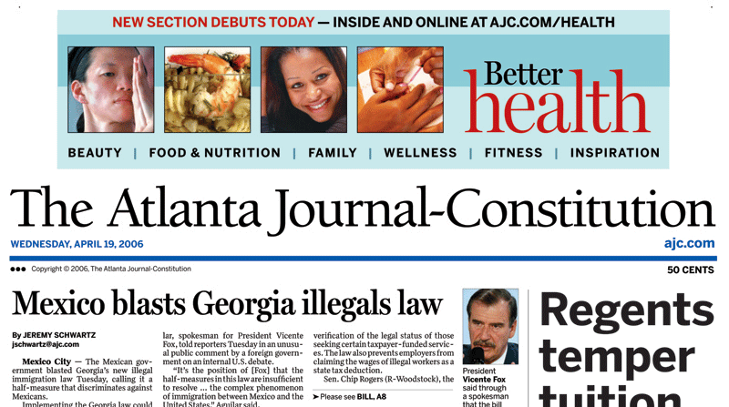
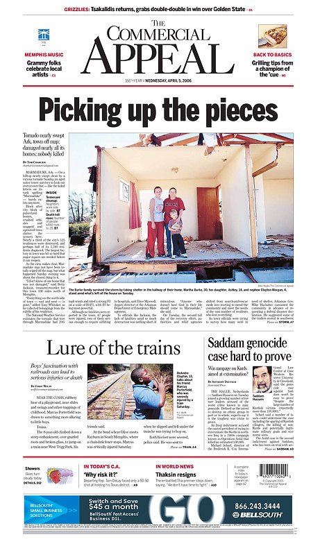
From a design standpoint I prefer the Sentinel. (full disclosure: I did not work last night so I had nothing to do with said page, however my boyfriend did shoot the picture and I'm quite proud of him.) But I'm not sure that's what's selling these papers. What is?
 Up in St. Lucie, Florida, a bunch of kids got busted with alcohol and drugs in their prom limo. Apparently, some kids asked for breathalyzer tests and were refused, while others told the truth about what happened and were subsequently punished. They're talking explusion for the kids, but yesterday's news was that some of the studens from, shall we say, more prosperous families are not being punished at all. Some students who weren't even in the limo staged a protest across the street from the school, too. Now, the Stuart News does a good job of keeping this on the front page by using the tried and true document-highlighting centerpiece. Yeah, it's been done, but it doesn't always work. Nice work, Stuart.
Poynter has an interview up with Brady Dennis, night cops reporter at the St. Petersburg Times. Dennis won this year's Ernie Pyle award for human interest writing. You're probably wondering now why I'm posting this on a design blog, but this wasn't just any old human interest story. Close your eyes for a moment and imagine a typical human interest story. Now imagine yourself designing it. Ugh, right? Requesting space, aruging about trimming two inches of the 80-inch narritive. Assuring the photo department you will do thier work justice despite the monstrosity in front of you. Well, here's what Dennis did. His feature, or series of them rather, was titled 300 Words. Yup. That's about it. Each piece highlighted a "regular" person and came in under nine inches. About once a month Dennis and photographer Chris Zuppa get together to tell their stories on the SPT's local front. Dennis says in his interview:I learned it doesn't take 3,000 words to put together a beginning, middle and end. A good story is a good story, no matter the length. And sometimes the shorter ones turn out [to be] more powerful than the windy ones.
That said, there's a risk of sounding like I'm advocating super-short stories with no traditional nut graph. Not so. I believe no matter how long or short the story, people should know why it is important and worth their time. It's not enough just to paint a pretty picture. We must strive to tell them something about the world that matters, to be journalists and not simply storytellers. Hopefully, in a non-traditional way, "300 Words" does that.
Refreshing and award winning! Read the Poynter story here. Read Dennis' work here and here, and if anyone from the SPT would like to send along some examples of how this was handled on your local fronts please pass 'em on to nicole.bogdas@gmail.com.
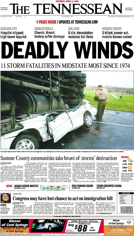
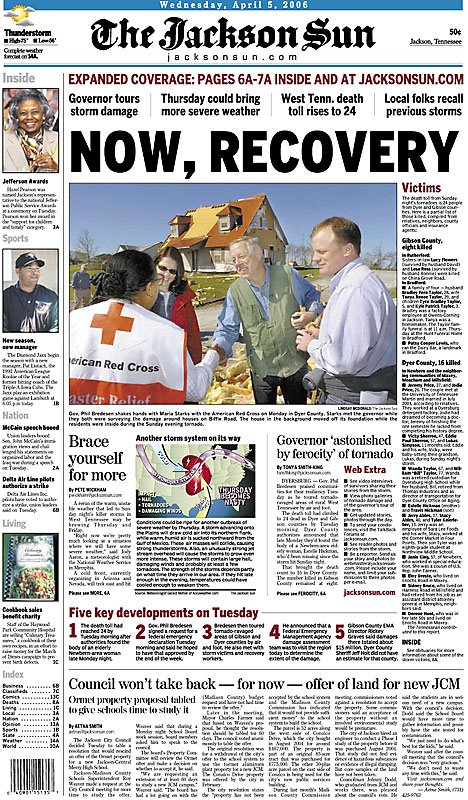
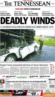 Weathering another bout of storms, The Tennessean pulls off this awesome page.

 It's so nice to see the women's championship game get similar play to the men's. Nice work!Also, check out sportsdesigner.com for pages from the men's game (and soon from the women's? Nudge, nudge, guys.)
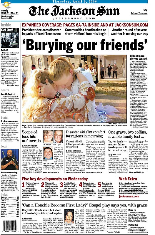
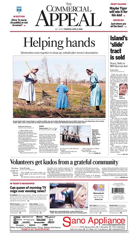
 Not just an eye-catching a design, but an interesting story, too.