

Ok, so it makes me crazy that I can't figure out this blogging thing. The design problems with this site make me want to pull out my hair. Please forgive.
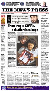
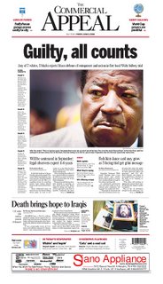
Now, we got lots of good stuff from the region today! Zarqawi and others. Enjoy and comment. I like how the News-Press really made the death of Zarqawi local, and the Commercial Appeal is striking.
My one quibble of the day is that I keep seeing the black on the front of the State as opposite, like the tan boxes are not on top of the black box, but rather there's black lines between the boxes. Does anyone understand what I'm saying? Does anyone else see it too?
UPDATE: Master of all things copy desk related, Fred Vultee at the University of Missouri, posts this about the State's page over at his super blog Headsup:
Every now and then one of your originating desks gets .... well, original, and tries to "add" "value" to something it isn't set up to add value to. That's the problem with this enterprising centerpiece. Steering away from the who-what-where approach on a story that's been in play since 3 the previous morning is the right idea. But not all such efforts are equal, and this one should have been thrown back. It subtracts more from the sum of human knowledge than it adds.
I won't lie, I didn't read the page before I posted it here, and still think it's well designed, but Freddo makes some good points as well as sending folks to the conversation on the same topic at Testy Copy Editors. Obviously, we don't know from where the content originated, so I hope I'm not offending a well-meaning designer, though I believe that's Mr. Vultee's point; the idea wasn't bad, necessarily, just not, um, good. Discuss.
3 comments:
Sorry, I thought the "Five to Fear" package at The State was just silly. I've been trying to post something but can't get the fronts to load. Is Blogger acting out today or something?
Fred, just linked to your post at headsup. Made the point that content-wise, you're certainly right, but from afar and assuming that sometimes you do what you can with what you're given, it's a pretty good lookin' page.
Hey, Nicole: Tnx for the link, and even more tnx for the, uh, loan of the JPEG of the page.
I do think it's a compelling page, and it's about 10 minutes of lively discussion away from being a good idea turned great. If I get a final five seconds of sermon: Critique the idea, not the source. As you said, discuss. And if it's the designer who points out that soembody's putting apples in a bag marked oranges, pay heed.
Post a Comment