skip to main |
skip to sidebar
Apologies to the ignored
So, it's a big week for sports, you know, with the Olympics and all...I've been too busy watching them (I seriously don't care that the couple from China fell and almost bowed out...they kicked the Russians' butt) to post pages. Here's a couple from NPD. Orlando, can you tell us more about your page toppers? If you've got special sections or exceptional pages send 'em to me at nicole.bogdas@gmail.com and I'll get 'em up here. Good luck and good deadlines.Update: I apparently am not the only one to ask about Orlando's olympic treatment. Chris Olds passes this along (follow the link for more pages):The Olympics flag is made up of Italian marble tiles. Something simple and earthy that has oomph, but not too much. (It was a risk, but was liked here. You aren't the 1st one to ask what they are, either.)


1 comment:
I dig Savannah's effort, but I have two slight beefs:
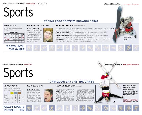
1.) Using the logos to indicate today's sports isn't a bad idea. But they're not always the most self-explanatory logos. Of course, you could argue you don't need words since most folks will recognize the logos from the TV broadcast. Except ...
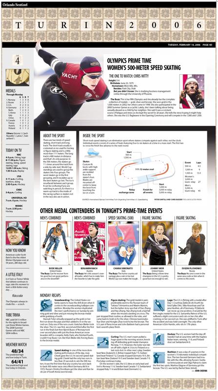
2.) They're actually the SLC 2002 logos, not the ones for Turin. Really, they're all the same sports, and the SLC ones do look more "American" (not to mention actually have a hope of registering correctly, unlike Turin's blue-on-blue-on-blue) but ... they're not the ones being used on TV, or anywhere else in the world. (See how O-town worked around it by coming up with their own logos, which are tight, register well, and clearly ID the sports. But they still included the sport names.
Post a Comment